Building an API and Web Viewer For Visualizing Tessel-generated Weather Data
This is the second article in a series about my first internet of things project working with Tessel microcontollers and sensor data. Read about the initial setup of the Tessel Weather Station in the Getting Started article.
If you want to go straight to the code, there are two repositories I'll discuss on this page, the Tessel Data Server repo and the Tessel Data Viewer repo. The server uses Node and Mongo to store and serve data and the viewer is my front-end playground for experimenting with data visualizations.
With the Tessel ready to report weather data I needed a simple API for storing that data in a Mongo database. The first endpoint accepts POST data and blindly dumps it into a Mongo collection. I kept the endpoint simple to allow for maximum flexibility as this project grows.
Here's the code for the POST route:
Hit up the project repo if you want to see this code in context.
One important note here is that you'll see in that request I'm overwriting the POSTed date property with a server-generated date. It didn't take long working with the Tessel before I realized its timestamps could easily be inaccurate. Seems obvious in hindsight considering the unit has no battery and is frequently unplugged during testing.
After the POST route was working I added a simple GET endpoint to be able to view the most recent weather data and then built the main endpoint I'd use to start playing with data visualization: /api/weather/date/range/:start/:end
The endpoint returns all data for a given range with dates being ISO format. Here's the code:
With this finished, I could start working on the interface and be able to explore display of weather data in ranges of varying length.
Down the Rabbit Hole with Visualization Libraries
When I started this project I had no experience with Javascript charting and/or visualization libraries so I did a little research and determined that initially, it was best to use something simple suited to quick-and-easy graph/chart display. My colleagues kept suggesting I get familiar with D3js, and I hope to, but that is such a deep subject that I've punted on learning it for now.
I initially had success with chart.js and so I've continued using it for basic line and area charts.
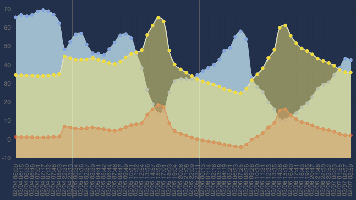
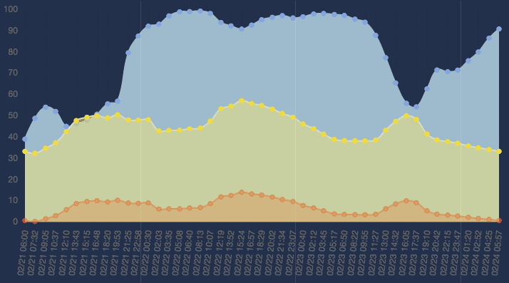
Here are some charts of weather in February. The faint white lines show the date changes at midnight. Red dots represent temperatures in degrees Celsius, yellow in Fahrenheit and blue dots represent the relative humidity percentage.
Here's data from early tests over a 3-day period:

The first issue you'll see I still have not resolved and that is accounting for missing time data. On the first day, there is a 14-hour gap in the data which is hidden by the chart. You see it in that quick jump in temperature that angles quickly upward on the left side of the graph.
Plotting the data on a time scale is one of the next issues to resolve with these visualizations.
The other issue you see is the exaggerated mid-afternoon temperatures. The yellow and red peaks are exaggerated because the climate sensor wasn't adequately protected from direct sun.
Here is a more recent 3-day span in better shape. The direct sun issue is resolved and while I am not yet plotting data on a time scale, I have no gaps in reporting so the charts are more accurate:

Early on I could see that I'd need to filter data. You can see in the first chart above that the data points are really crammed together. Currently the Tessel reports weather data once per minute and that's more data than most of my visualizations will need.
Initially the only way I was filtering data was on the front end. On the page you see in the chart graphics above, I was passing a step counter to the function that draws the chart to reduce the amount of data using a for loop:
Effective yes. Performant, no. At times I was retrieving 50-60 times as much data as I wanted from the database. That needed to change. It just felt ridiculous asking for so much more data than I needed.
You can see in that for loop above I'm creating arrays for the labels, the temperature (°C and °F) and the humidity to plot on the chart.
Time for an Index
Many of my queries needed data sorted by most recent date, so in Node queries I was sorting documents by their date properties. This was taking quite a while until I realized what the problem was - no index. The Saturday I realized that, one simple line of code in the Mongo shell made my day (and made the database so much more peppy):
db.weather.ensureIndex({date:-1});
Performance issues resolved. It's the simple things in life.
What I haven't mentioned yet is that at this point, I've stopped using a Mongo database on my laptop and am now using a dedicated Raspberry Pi for the Mongo/Node server. So this index really came in handy as the Pi was pretty slow at returning sorted results. Now it's peppy. Money.
Filtering on the Server
It seemed clear that over time I'd be collecting a ton of weather data and I really needed to spend some time thinking about how to best reduce datasets down to manageable result counts. I knew I could reduce data down using a simple for loop but I also knew there had to be better and more performant ways to limit the data. And if I was ever going to have visualizations that span date ranges longer than a week, I was definitely not going to be able to cram all that data in the browser before filtering it.
I spent some time reading Mongo docs and determined that I could use the Mongo cursor's each() function to iterate through data returned from Mongo in a non-blocking manner. The Mongo cursor's toArray() function requires all the data to be returned from Mongo before returning an array of that data. The each() function does not require all data to be returned and instead streams data from Mongo to the cursor's each() loop as that data is returned from Mongo. As you'll see in the following code, my each() function looks at dates to ensure that there is only one data document per hour dumped into the array that is returned from this endpoint.
You can see on line 36 the check is made using a custom docDateIsNextHourPlus() function which compares two dates to see if the current date is at least an hour after the date of the previously-stored data object.
I originally wanted the function to make sure the current hour was exactly in the hour following the previously-stored data object but because of the gaps in my data, I had to make the function more flexible and just check to see that the new date is greater than the old date + 1 hour.
You may recognize that I'm using moment.js to simplify the date math. Such a time saver.
Once I got this script running I was surprised at how fast it returned results. At this point, I've got enough flexibility from the backend to be able to continue exploring visualizations.
Moving the Server to Raspberry Pi
From the beginning of this project I knew that I'd want a dedicated server to store not only the weather data but data from additional sensors I plan to add to this project (ambience, barometric pressure, etc). I also knew I want to try using a Raspberry Pi for this server just to see how well it handles the task.
Getting the Pi setup with Node and Mongo was pretty easy. There are plenty of tutorial pages showing how to do this and because current iterations of the Raspberry Pi are quite peppy, the installation goes pretty quickly. Before you know it, you're up and running with Node and Mongo. Here are the basic steps I took:
- Install Raspbian on the Pi (using NOOBS or doing it manually)
- Install NodeJS (instructions here or here will work)
- Install MongoDB (I used these instructions )
- Setup your SSH key so you can use git via SSH (instructions here)
- Install your Node/MongoDB application
- Give your Pi a static IP address (instructions here) to keep from having to update your Tessel reporter/client code
Looking to the Future
Currently things are working smoothly and my next steps will involve:
- Trying to improve the Tessel stability so it runs for longer periods without cutting off
- Continue exploring visualizations focusing initially on plotting data on a time scale
- Adding functionality to the data server so it backs its data up to another server
- Building an Arduino weather reporter to compare against the Tessel weather reporter
- Building a more permanent housing for the Tessel so it is protected against our hot and stormy summers